Theming
Apps built with Qt Material UI can be customized to fit their individual needs and to offer user personalization.
Design Tokens Introduction
Theming in Qt Material UI is based on the design token system. Any aspect of the UI can be customized by changing the values of these tokens. To learn more, read the Material Design 3 documentation.
Token Hierarchy
There are generally 3 useful hierarchical level of design tokens, though they can technically have any number of indirections.
Component Tokens: Tokens that define an aspect of a general component. These typically refer to a system token, but in some cases may refer to a value directly.
Apps may wish to override these if one particular component is frequently having its style altered in a consistent manner throughout the codebase.
Eg,
md.comp.elevated-button.label-text.fontSystem Tokens: Tokens that define the design system (aka Material Design 3). These typically refer to a reference token.
Apps may wish to override these to customize the look and feel across multiple component types. This can make the app feel completely different from the Material Design aesthetic, which may or may not be desired.
Eg,
md.sys.typescale.label-large.fontReference Tokens: Tokens that refer to an underlying value.
Apps may wish to override these to set the most foundational app look, such as font family and overall sizes.
Eg,
md.ref.typeface.plainUnderlying Value: This can be a color, number, font name, etc.
Eg,
"Roboto"
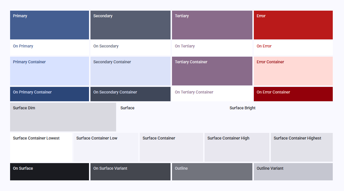
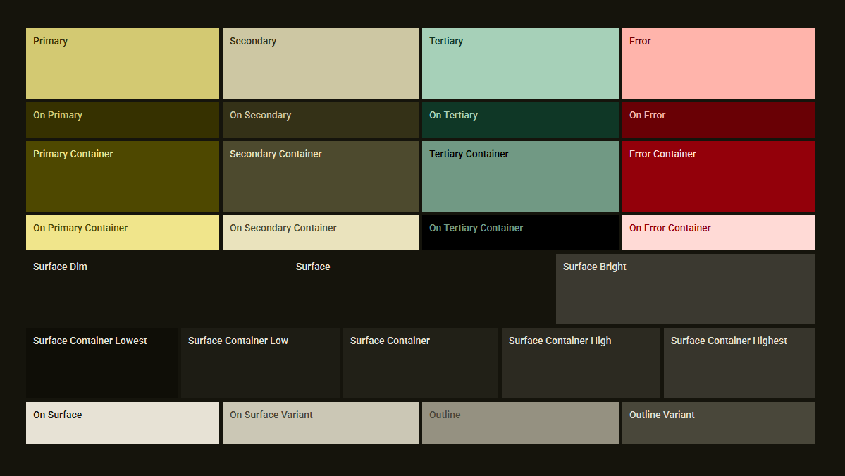
Customizing the Color Scheme
One of the most common theming requirements is the color scheme. Thankfully Material 3 provides a systematic approach to generating colors, which Qt Material UI leverages with the materialyoucolor dependency.
This approach also gives the option to generate the scheme in dark or light mode, and even different contrast levels for accessibility needs.
Below is a minimal overview of setting a color scheme. For a more complete example, including runtime customization, check out the color palette sample.
from material_ui.theming.dynamic_color import apply_dynamic_color_scheme
# external dependencies
from materialyoucolor.hct import Hct
from materialyoucolor.scheme.scheme_tonal_spot import SchemeTonalSpot

# Call this somewhere in the app initialization code, or whenever the
# color scheme needs to be updated.
def apply_color_scheme():
    scheme = SchemeTonalSpot(
        Hct.from_int(0xFF4181EE),  # source color in ARGB format
        is_dark=True,  # dark mode or not
        contrast_level=0.0,  # contrast level, can aid readability
    )
    apply_dynamic_color_scheme(scheme)
Tip: To access the system default dark or light mode in Qt, check out the
QStyleHints.colorSchememethod.
Customizing the Fonts
Docs in progress...